
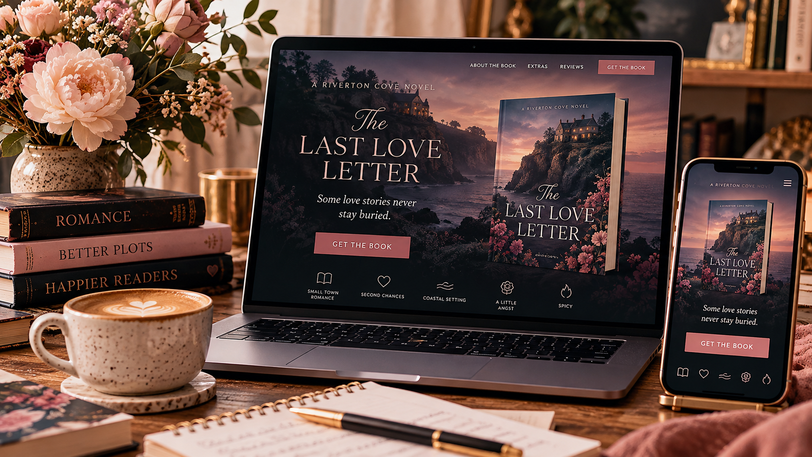
You’ve spent months—or years—writing the book. You’ve agonized over the cover, rewritten the blurb seventeen times, scheduled your newsletter, made the graphics, and perhaps developed a slightly unhealthy relationship with your preorder dashboard.
Then launch day arrives, readers click your link…and land on a page that gives them absolutely no idea what to do next.
That’s where effective landing page design matters.
A book release landing page isn’t simply another page on your author website. Unlike your homepage, which may introduce your entire author brand, your backlist, newsletter, social accounts, and latest news, a landing page has one specific job: get the reader to take the next step.
For a new release, that might mean preordering the book. Buying it. Joining your newsletter to receive a bonus epilogue. Downloading a reader magnet. Or clicking through to their preferred retailer.
The best landing pages remove everything that gets between “Oh, I want this book” and “I know exactly what to click.”
For romance authors especially, that means combining smart conversion strategy with the emotional experience readers expect from your books. Your landing page shouldn’t feel like generic marketing software wearing your book cover as a hat. It should feel like an extension of the story you're asking readers to fall in love with.
What Makes an Effective Landing Page for a Book Release?
First, we need to distinguish a landing page from a regular author website page.
Your homepage has multiple jobs.
It might introduce your author brand, showcase several books, invite readers to join your newsletter, send them to your About page, highlight reviews, and help someone explore your entire fictional universe.
A landing page is much more focused.
Someone arrives because they saw your Instagram post about your new release, clicked a link in your newsletter, followed an ad, scanned a QR code at an event, or heard about the book somewhere else.
They've already shown interest.
Your landing page's job is to turn that interest into one clear action.
For a book release, that action might be:
- Preorder or buy the book.
- Choose a preferred retailer.
- Join your email list.
- Download an exclusive bonus.
- Read a sample.
- Add the book on a reader platform.
- Continue into a launch-specific reader funnel.
That distinction should influence every design decision you make.
If your romance book release landing page contains your entire website navigation, ten different promotions, three newsletter forms, links to every social account you've opened since 2014, your entire backlist, and a button inviting readers to read your blog…
You've created choices instead of direction.
Effective landing page elements for authors work together to answer three questions very quickly:
What is this? Why would I want it? What should I do next?
That's it.
You Might Like: What Should an Author Website Include? A Romance Writer’s Guide
Essential Landing Page Elements for Authors
A beautiful landing page isn't necessarily an effective one.
This is an important distinction when you're designing landing pages for books. Authors naturally care about aesthetics—and they should. Covers, typography, imagery, colors, and branding communicate genre before readers consciously process the words on the screen.
But every pretty element should support the page's purpose.
Here are the pieces I consider essential.
1. A Headline Written for Your Reader
Don't make your book title do all the work.
Your headline should immediately communicate something about the experience you're offering.
Imagine you're releasing a paranormal romance about a ghost hunter, a detective, a haunted Victorian house, and the woman caught between them.
The headline could simply be:
Nothing Haunts Like a Heart
Pretty. Atmospheric. But unless the reader already knows the book, it doesn't tell them much.
Compare that with:
Some houses are haunted by ghosts. This one is haunted by desire.
Now we're creating an emotional promise.
Your headline doesn't need to summarize the plot. In fact, it probably shouldn't.
Sell the experience of reading the book.
2. Your Book Cover—Big Enough to Matter
Your cover is one of your most powerful marketing assets. Don't bury it in a tiny column halfway down the page.
Feature it prominently near the top.
And please—give it room to breathe.
Your designer carefully chose those fonts, colors, characters, and visual cues to communicate dark romance, rom-com, romantasy, small-town contemporary, or whatever beautiful flavor of emotional devastation you're serving.
Let the cover work.
3. One Obvious Primary CTA
Your call to action should never require detective work.
Preorder Now.
Get the Book.
Start Reading.
Claim the Bonus Epilogue.
Whatever your conversion goal is, make the primary button visually obvious and use it consistently throughout the page.
You can absolutely offer multiple retailers beneath that CTA—Amazon, Barnes & Noble, Apple Books, Kobo, direct sales, etc.—but don't make readers decipher what they're supposed to do.
Good landing page best practices reduce friction instead of introducing it.
4. Benefit-Driven Book Copy
Your book description matters, but landing-page copy doesn't necessarily need to duplicate the retailer description word-for-word.
Think about the reader asking:
Why is this my next read?
That might mean highlighting:
- tropes
- emotional promises
- spice level
- character dynamics
- setting
- series information
- exclusivity or preorder bonuses
Your page should make the book easy to mentally categorize.
If I'm a reader desperately hunting for an age-gap, forced-proximity romance with an older protective hero and a painfully slow burn, tell me you've got one.
You're not spoiling the experience.
You're helping the right reader recognize it.
5. Social Proof
Reader reviews, editorial quotes, awards, bestseller status, or other legitimate credibility indicators can help reinforce the decision to buy.
The key word there is legitimate.
Three short, specific reviews are usually more useful than an enormous wall of praise.
And if this is your first book and you don't have reviews yet?
That's okay.
Don't manufacture authority. Let your cover, positioning, tropes, excerpt, and copy do more of the work.
6. Trust Signals
If you're asking for an email address or selling directly, reassure readers.
Tell them what they're signing up for. Make your privacy information accessible. If you're taking payments, make the purchasing process feel secure and professional.
Readers shouldn't have to wonder what happens after they click.
7. Repeated CTAs
A reader who reaches the bottom of your page shouldn't have to scroll all the way back up to buy the book.
Repeat your CTA naturally after major persuasion points.
That's not being pushy.
That's good UX.
Read Also: Color Palette for Romance Authors: A Complete Guide
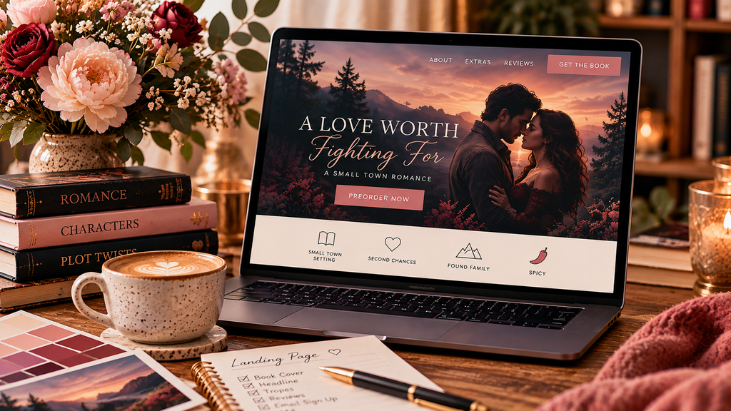
How to Design an Effective Landing Page for a Romance Novel
This is where generic landing page advice stops being enough.
You're not selling project-management software.
You're selling feelings.
Romance readers choose books based partly on recognizable emotional and visual signals. Your landing page needs to speak the same visual language as your book.
A sweet small-town romance shouldn't suddenly live on a stark corporate-looking landing page because somebody told you blue buttons convert well.
Likewise, a gothic romance probably shouldn't look like the website for a cupcake bakery.
Use your cover as the starting point.
Pull supporting colors from it. Use typography that complements the cover without sacrificing readability. Carry visual motifs from the story into the page subtly.
A coastal gothic might use weathered textures, restrained serif typography, moody photography, and generous dark space.
A bright rom-com might use energetic typography, playful illustrations, punchier color, and more visual movement.
A dark romance can feel luxurious and dangerous without making every single element black and blood-red.
Genre recognition should happen almost instantly.
And that's one of my biggest romance author website tips in general:
Your brand shouldn't simply tell readers what you write.
It should help them feel what you write.
Don't Let Your Navigation Steal the Reader
One of the strangest things about creating a landing page for authors is that sometimes good website design means removing pieces of your normal website.
Your primary website navigation is useful when someone wants to explore.
It can be counterproductive when someone has arrived specifically to buy a book.
Consider using simplified navigation—or none at all—for a dedicated launch page.
You don't necessarily want a reader thinking:
Ooh, About. Wonder what's over there.
Click.
And they're gone.
Your landing page is a controlled path. Removing unnecessary exits makes that path easier to follow.
Landing Page Copy: Sell the Reading Experience, Not the Product Specifications
Authors sometimes write landing-page copy as though they're filling out a database.
384 pages. Available in ebook and paperback. Book two of the series. Releases October 14.
Useful information?
Absolutely.
Persuasive?
Not particularly.
Compare that with:
A haunted house. A thirty-four-year-old murder. Two men determined to protect her—and a ghost determined to tell the truth.
Now I want to know something.
Your landing-page messaging should communicate the emotional value of reading the book before getting buried in specifications.
That means understanding the difference between features and benefits.
“384 pages” is a feature.
“A slow-burn romantic suspense you can disappear into all weekend” is a benefit.
“Bonus epilogue included with preorder” is a feature.
“See what happens after the happily-ever-after” is the emotional benefit.
This is especially valuable for romance novel marketing strategies, because romance readers often shop according to the emotional experience they're craving.
Your landing page can make that experience explicit.
Create Urgency Without Screaming at People
You do not need:
BUY NOW!!!! ONLY 72 HOURS LEFT!!!! DON'T MISS OUT!!!!
Please don't emotionally mug your readers.
Real urgency is enough.
If a preorder bonus expires on October 10, say so.
If a signed edition has limited quantities, tell readers how many are available.
If introductory pricing ends after launch week, explain when.
Specificity creates believable urgency.
Artificial scarcity creates skepticism.
How to Create a Book Landing Page in 5 Steps
You don't need to reinvent your entire website every time you publish a novel.
Start simple.
Step 1: Decide on one primary conversion. Determine exactly what you want visitors to do. Preorder? Purchase? Subscribe? Claim a bonus? Don't start designing until you can finish the sentence: The primary purpose of this page is to get readers to ______.
Step 2: Build your visual direction from the book. Pull your colors, imagery, typography, and atmosphere from the book's existing brand rather than designing an unrelated mini-site.
Step 3: Build the persuasion hierarchy. Start with your emotional hook, cover, CTA, and essential release information. Then add description, tropes, reviews, bonus material, retailer options, FAQs, and repeated CTAs as needed.
Step 4: Remove friction. Test the page on your phone. Click every button. Complete the signup form yourself. Check loading speed. Ask whether every section helps the reader move toward your primary conversion.
Step 5: Launch, measure, and improve. Your first version doesn't have to be your final version. Watch what readers actually do and improve the page accordingly.
That's how to create landing pages without turning every book release into a second full-time job.
See More: Selecting Typography That Resonates with Romantic Themes
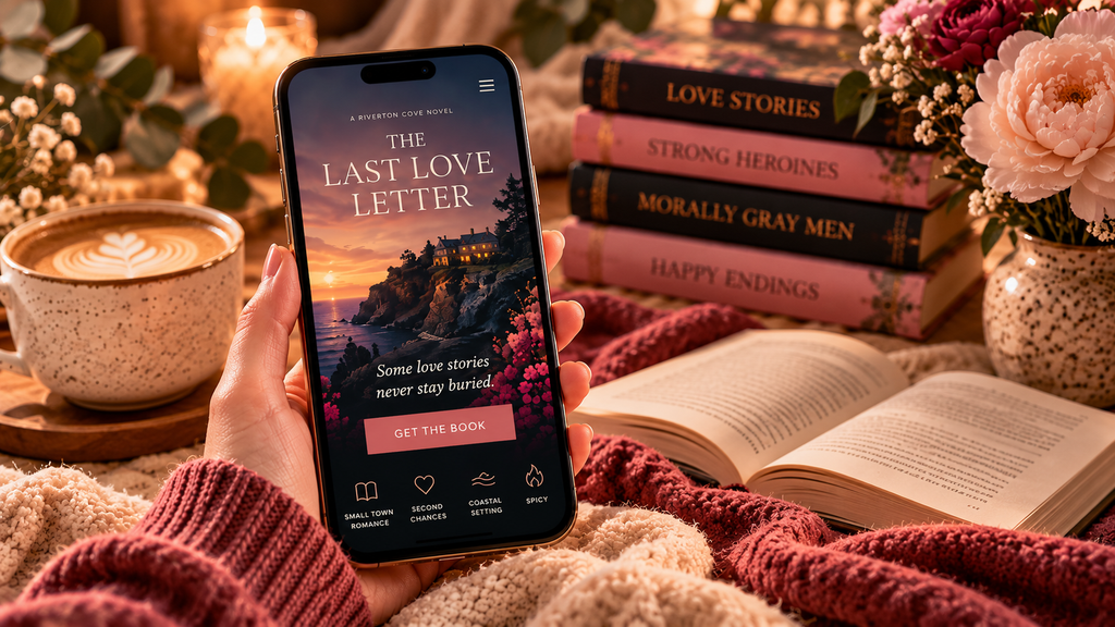
Technical Optimization Matters More Than Authors Think
Here comes the less sexy part.
Your gorgeous page still has to work.
And one of the most important considerations is mobile.
Readers may encounter your book while scrolling Instagram, opening your newsletter on their phone, clicking an ad, or following a link from another author.
If the mobile version has a microscopic book cover, overlapping text, gigantic images that take forever to load, or a preorder button somewhere in another zip code, you've introduced friction at exactly the wrong moment.
Test your landing page at multiple screen sizes.
Compress your images.
Make buttons large enough to tap comfortably.
Keep important copy readable.
Simplify forms.
And don't ask readers for seven pieces of information when all you actually need is an email address.
Measure What Readers Actually Do
One advantage of a dedicated book page is that it gives you something specific to measure.
Instead of vaguely wondering whether your website is “working,” you can look at behavior tied to one campaign.
How many people reached the page?
How many clicked your purchase button?
How many signed up?
Where did visitors stop scrolling?
Which traffic source brought readers who actually converted?
If hundreds of people visit and almost nobody clicks your CTA, something needs attention.
Maybe the copy isn't persuasive.
Maybe the button isn't obvious.
Maybe readers aren't getting enough information.
Maybe the traffic itself isn't well targeted.
This is also where A/B testing can become useful once you have enough traffic to make the comparison meaningful.
You might test two headlines, CTA wording, hero layouts, or the placement of your reviews.
Don't change seventeen things at once.
If version B performs differently, you'll have no idea why.
Your Landing Page Isn't Useful Without Traffic
A beautiful page sitting alone on the internet isn't a marketing strategy.
Your book launch ecosystem should feed readers toward it.
That might include your newsletter, Instagram or Facebook posts, paid ads, cross-promotion with other authors, book-promotion services, QR codes on physical materials, or links from relevant pages elsewhere on your website.
And don't automatically delete or abandon the page once launch week ends.
A well-built book landing page can continue serving organic visitors, readers moving through your backlist, and people discovering you months—or years—later.
Update the CTA from Preorder Now to Buy Now, remove expired bonuses, and keep the useful content alive.
Budget-Friendly Landing Pages vs. Custom Designs
You do not need a $5,000 custom sales funnel to launch your first romance novel.
You also don't need to build every page yourself forever.
The right investment depends on where you are in your author career.
If you're launching your first or second book with a modest platform, your existing WordPress website and page builder may be perfectly capable of producing a strong page.
Start with good hierarchy, responsive design, strong branding, clear CTAs, and solid copy.
As your platform grows, custom development becomes more valuable when you need more sophisticated functionality, reusable release templates, direct sales integration, advanced tracking, automation, or a more distinctive branded experience.
The question isn't:
“Does a professional author need an expensive landing page?”
It's:
“What does my landing page need to accomplish right now?”
Build for that.
Then scale.
What Effective Book Release Landing Pages Have in Common
There isn't one magical layout every author should copy.
And that's a good thing.
Your readers aren't interchangeable. Neither are your books.
A spicy contemporary romance, sapphic rom-com, paranormal why-choose, historical romance, and gothic romantic suspense shouldn't all have identical landing pages with different covers dropped into the same rectangle.
But high-converting landing page design tends to share the same underlying logic:
Clear message.
Strong visual hierarchy.
Recognizable genre cues.
Reader-focused copy.
Minimal distractions.
Obvious calls to action.
Fast, responsive performance.
Trust.
And a page that understands precisely what its reader came there to do.
That's far more important than chasing whichever design trend happens to be popular this year.
Frequently Asked Questions About Book Landing Pages
How do I design an effective landing page for my book release?
Begin with one primary conversion goal, such as preorders or purchases. Build the page around a strong reader-focused headline, prominent cover, emotional positioning, clear CTA, supporting social proof, and relevant book information. Remove elements that distract readers from that action.
What is the best design for a romance book landing page?
There isn't one universal design. The visual direction should reinforce the subgenre and emotional experience of your specific book while maintaining clear hierarchy and usability. Your dark gothic romance and sunshine-filled beach rom-com shouldn't look like they were separated at birth.
What makes an effective landing page convert readers into buyers?
Clarity and relevance matter enormously. Readers should quickly understand what the book offers, why it matches their interests, and where to click next. Strong design then supports that decision rather than competing with it.
Do I need coding skills to create a book landing page?
No. Many authors can create functional landing pages with WordPress page builders and other no-code tools. Coding becomes useful when you want custom functionality or more control, but it isn't a prerequisite for creating a landing page.
How much should I spend on a landing page for my book launch?
There's no universal number. Your investment should reflect your current audience, marketing strategy, functionality requirements, budget, and expected use of the page. A newer indie author can start lean and improve the system as their platform grows.
What conversion rate should I expect?
Be careful with universal benchmarks. Results vary depending on the quality and source of your traffic, your existing audience, genre, offer, book positioning, price, and what you're counting as a conversion.
Should I use a landing page builder or hire a designer?
Use a builder when your needs are relatively simple and you're comfortable handling the design yourself. A professional designer becomes more valuable when you want stronger branding, custom functionality, strategic conversion design, or a reusable system that works across multiple releases.
How long should my book landing page be?
Long enough to answer the questions standing between your reader and the CTA—and no longer. A warm audience that already knows your book may need very little persuasion. Cold traffic may need more context, social proof, trope information, excerpts, FAQs, or reassurance before clicking.
Your Landing Page Should Feel Like Your Book
Here's the part I wish more authors understood about effective landing page design:
Conversion strategy and beautiful branding are not enemies.
You shouldn't have to choose between a page that feels like you and one that works.
The best author websites do both.
Your landing page can be atmospheric, romantic, sexy, funny, haunting, elegant, whimsical, dark, or delightfully unhinged while still maintaining strong hierarchy and giving readers an obvious path forward.
In fact, that's the goal.
Because you're not just selling a file someone can download to their Kindle.
You're asking a reader to give you several hours of their time and step into a world you created.
Your website gets to open the door.
Planning a book release and want a landing page that actually feels like your author brand? Katherine Magpie Design creates strategic WordPress websites for romance authors that combine reader experience, author branding, and smart conversion design—without turning your site into another generic marketing template.