
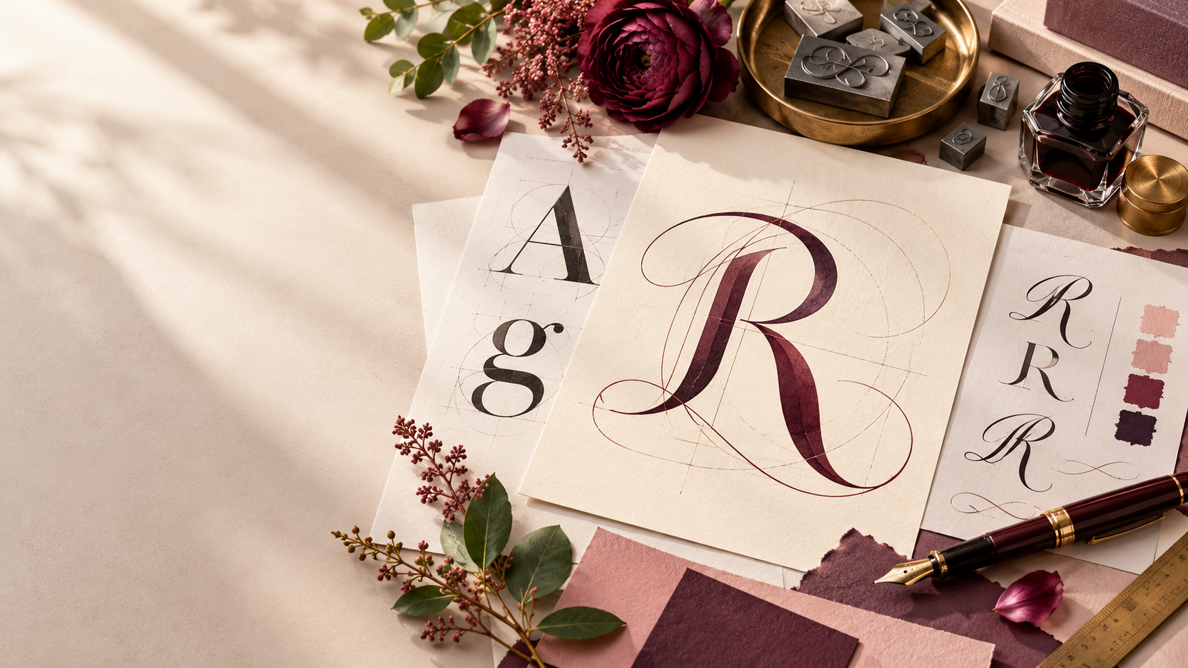
Romantic typography is more than a script font and a blush color palette. It is the deliberate use of letterforms, spacing, hierarchy, and contrast to create a feeling of intimacy, warmth, elegance, longing, or playfulness. The strongest romantic typography choices work because they support the emotional tone of the design without sacrificing clarity.
Selecting typography that resonates with romantic themes means understanding why certain shapes feel soft, graceful, dramatic, or personal, then pairing those expressive qualities with readable supporting type. Whether you are designing a romance author website, wedding invitation, book cover, boutique brand, or relationship-focused digital experience, the goal is the same: let the typography carry emotion without forcing the reader to work for the message.
Understanding the Psychology Behind Romantic Typography
Typography can influence how a message feels before a reader consciously processes the words. Rounded forms often feel softer and more approachable. High-contrast serifs can feel elegant, literary, or luxurious. Flowing scripts can suggest handwriting, which creates a sense of intimacy and personal connection.
That emotional response is not created by one feature alone. Curves, stroke contrast, letter spacing, x-height, weight, and rhythm all work together. A delicate serif with generous spacing can feel restrained and romantic. A brush script with dramatic swashes can feel passionate and expressive. A clean sans serif with rounded terminals can still feel warm and contemporary.
The context matters too. The same ornate script that feels beautiful on a wedding invitation may feel impractical in a mobile navigation menu. Romantic typography is most effective when emotional tone and usability support each other rather than compete.
Key Characteristics of Fonts That Evoke Romance
Romantic fonts tend to share a handful of characteristics, though not every romantic design needs all of them at once.
- Flowing curves and graceful stroke movement
- Elegant serif details that create sophistication
- Moderate or high stroke contrast for a refined feel
- Ligatures, swashes, and alternate characters used selectively
- Soft spacing that allows letterforms to breathe
- A clear hierarchy between expressive display type and readable body type
The most important practical rule is readability. Decorative details should enhance a short phrase, title, or name—not overwhelm a paragraph. Script and display fonts usually work best in small doses, while body copy benefits from simpler serif or sans serif families.
OpenType features can also add personality. Ligatures can smooth awkward letter combinations, and swashes can create a more ornamental finish. They should be treated like seasoning. A few intentional flourishes feel elegant; too many can make the design feel busy or cliché.
Best Font Categories for Romantic Design Projects
Classic script fonts
Script fonts are the category most people associate with romance because they mimic handwriting and calligraphy. They can feel personal, elegant, playful, or passionate depending on the stroke style. Use them for names, short headlines, invitations, pull quotes, or accent words rather than long paragraphs.
Elegant serif fonts
Serifs are ideal when you want romance to feel timeless, literary, polished, or editorial. High-contrast serifs can bring sophistication to book covers, author websites, luxury wedding brands, and print collateral. Softer old-style serifs can feel warm and human without becoming overly formal.
Soft modern sans serifs
Romantic design does not require ornate typography. Rounded or humanist sans serifs can feel intimate and contemporary, especially for modern romance brands, apps, and websites. They are especially useful when the overall design already includes expressive photography, illustration, color, or decorative details.
Display fonts with romantic character
A distinctive display face can create mood quickly through dramatic contrast, unusual terminals, vintage references, or playful shapes. These fonts are strongest in headlines and campaign graphics where personality matters more than extended reading comfort.
The Three Font Rule Applied to Romantic Design
The three font rule is a practical way to keep typography expressive without losing cohesion. You do not have to use three fonts, but three is a useful upper limit for many romantic design systems.
- Choose one expressive display font. Use it for the emotional moment: a title, name, logo lockup, or major heading.
- Choose one readable supporting font. This is your workhorse for body copy, captions, navigation, and longer text.
- Add a third font only when it has a clear role. It might be a small-caps serif for labels, a neutral sans serif for UI, or an accent script for special moments.
Contrast is what makes the system work. Pair expressive with restrained, delicate with sturdy, or traditional with modern. Avoid choosing three fonts that all compete for attention. A romantic design should feel layered, not crowded.
One common mistake is pairing two highly decorative fonts that both want to be the focal point. Another is choosing fonts that are too similar to create a useful hierarchy. The best pairings create a clear visual relationship while giving each typeface a separate job.
Selecting Typography for Different Romantic Contexts
Wedding invitations and save-the-dates
Wedding stationery can support more decorative typography because the text is usually short and highly intentional. A calligraphic script paired with a classic serif is a dependable approach, but modern sans serif combinations can also feel romantic when spacing, hierarchy, and paper choices are handled thoughtfully.
Romance book covers and author brands
Book-cover typography has to communicate subgenre quickly. A historical romance may benefit from a refined serif or calligraphic influence, while contemporary romance can support bolder sans serifs, handwritten accents, or fashion-forward display fonts. The title should remain readable at thumbnail size, which makes hierarchy especially important.
Apps and relationship-focused websites
Digital interfaces require more restraint. Decorative fonts should usually be limited to headlines, logos, or promotional moments. Navigation, buttons, forms, and long-form content need fonts that stay readable across screen sizes and rendering environments.
Boutiques, florists, photographers, and romantic service brands
Service businesses often need romance to coexist with credibility. A polished serif or soft sans serif can provide professionalism, while a script or decorative display font adds personality in selected brand moments. The typography should support trust as much as beauty.
Technical Considerations When Choosing Romantic Fonts
Beautiful typography still has to perform well. Decorative web fonts can be heavier than simpler typefaces, so font loading should be part of the design decision. Limit unnecessary weights and styles, use modern font formats when available, and avoid loading a large family when you only use two weights.
Readability should be tested on phones, tablets, laptops, and high-density displays. A thin serif that looks elegant on a large desktop hero may disappear on a small screen. A script that looks charming at 48 pixels may become difficult to decipher at 22 pixels.
Accessibility matters just as much as aesthetics. Do not rely on decorative type for essential interface text. Keep sufficient contrast between text and background, avoid overly tight spacing, and make sure body copy remains comfortable to read. If a script or display font becomes difficult to scan, use it as an accent rather than a core reading font.
Print and digital typography also behave differently. Fine details and thin strokes may reproduce beautifully in print but render inconsistently on screens. For commercial projects, verify the font license before using it in websites, ebooks, templates, packaging, or client deliverables.
A Step-by-Step Process for Choosing Romantic Typography
- Define the emotional tone. Decide whether the project should feel dreamy, sensual, elegant, playful, nostalgic, literary, or modern.
- Choose the expressive typeface first. Select the font that best carries the emotional personality of the project.
- Pair it with a readable support font. Use contrast in structure, not chaos in style.
- Test hierarchy. Make sure titles, subheads, body copy, and labels are visually distinct.
- Test across devices or print sizes. Check the smallest realistic use case, not only the polished mockup.
- Review accessibility and performance. Confirm contrast, readability, and acceptable font-loading behavior.
- Remove anything unnecessary. If a third font, swash, flourish, or alternate character does not improve the design, cut it.
Common Mistakes to Avoid When Using Romantic Typography
The fastest way to make romantic typography feel dated is to overdecorate it. Too many swashes, scripts, flourishes, and ornate details can make a design feel costume-like instead of intentional.
Do not trade readability for atmosphere. A beautiful font that cannot be read is not serving the message. Avoid cliché by asking what the project actually needs instead of defaulting automatically to calligraphy. Romance can be quiet, modern, dramatic, playful, minimal, or editorial.
Finally, avoid choosing fonts in isolation. Typography should be evaluated alongside color, imagery, spacing, and the intended audience. A font that feels romantic in one visual system may feel completely different in another.
FAQ: Romantic Typography
What is a romantic font?
A romantic font is a typeface whose letterforms, spacing, contrast, or decorative details create an emotional impression of warmth, intimacy, elegance, affection, or sensuality.
What is the best font for romance?
There is no single best font for romance. The right choice depends on the tone of the project. Scripts can feel personal, serifs can feel timeless and literary, and soft sans serifs can feel modern and intimate.
What is the 3 font rule?
The three font rule is a guideline that limits a design system to no more than three typefaces, each with a distinct role. It helps preserve hierarchy and visual consistency.
What is a flirty font?
A flirty font usually has playful movement, rounded or handwritten qualities, unexpected curves, or light decorative details. It feels lively rather than formal.
How do I choose typography for a wedding invitation?
Start with the tone of the event, then pair one expressive font with one highly readable supporting font. Test names, dates, venue details, and small text at actual print size before finalizing the combination.
Are script fonts always romantic?
No. Script fonts can feel formal, casual, whimsical, retro, rustic, or dramatic depending on their structure. Context determines whether they read as romantic.
What colors work best with romantic typography?
Romantic typography can work with blush, cream, burgundy, black, jewel tones, soft neutrals, or even bright modern palettes. The important factor is sufficient contrast and a color system that supports the intended mood.
Can sans serif fonts be romantic?
Absolutely. Humanist, rounded, or elegantly proportioned sans serifs can feel warm, intimate, and contemporary, especially when paired with thoughtful spacing and imagery.