
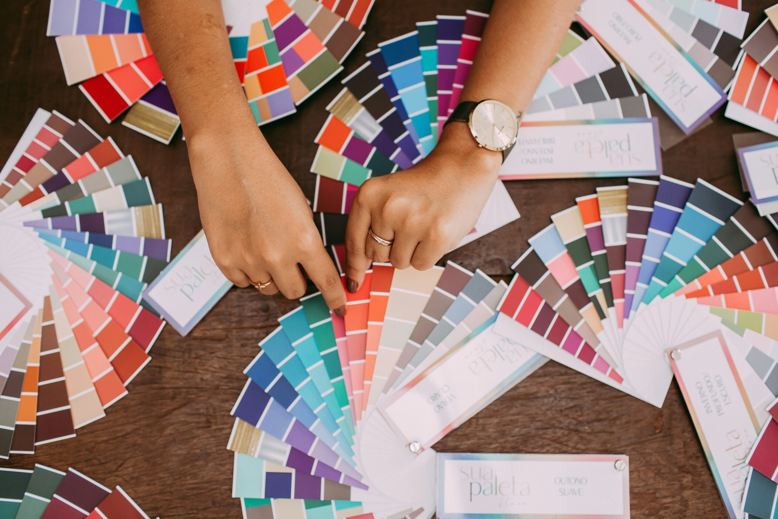
A romance author color palette is the small, intentional family of colors that readers repeatedly encounter across your website, social graphics, newsletter, launch materials, and other pieces of your author brand. The right palette does more than make those pieces look coordinated. It helps establish the emotional promise of your books before a reader ever opens one.
That is why choosing a color palette for romance authors should start with genre, mood, and reader expectations—not simply with a favorite shade of pink. A contemporary rom-com author, a gothic romance author, and a dark romantic suspense author may all write love stories, but their visual brands need to communicate very different experiences.
Why Color Choices Matter for Romance Authors
Romance is an emotional genre, and an author’s visual branding has to work on that emotional level too. Readers make fast judgments about whether a website, social post, or promotional graphic feels playful, sensual, comforting, dangerous, luxurious, historical, or mysterious. Color is one of the quickest tools you have for establishing that atmosphere.
Strong romantic color schemes for websites also make an author platform easier to recognize. When the same core colors appear in navigation, buttons, newsletter graphics, social media templates, and promotional materials, readers begin to associate those colors with the author rather than with one individual book.
This distinction matters. Your book covers can—and usually should—change to fit individual stories and series. Your author brand needs enough consistency to connect all of those releases. Effective color choices for romance therefore need to support both emotional storytelling and long-term recognition.
You Might Like: Integrating Author Branding into Website Layout: A Practical Guide
Understanding Color Psychology in Romance Writing
Color psychology in romance writing is best treated as a design tool rather than a rigid formula. Colors can carry common emotional associations, but those associations are influenced by context, culture, saturation, brightness, surrounding colors, and personal experience.
Red is the obvious example. A bright, clean red can feel energetic, passionate, or playful. Deep burgundy can feel sensual, mature, expensive, or dangerous. Pair that same burgundy with black and the effect may lean toward dark romance; pair it with warm cream and antique gold and it can feel historical or luxurious.
Pink can communicate softness, affection, optimism, femininity, or playfulness, but dusty rose behaves very differently from hot magenta. Purple can suggest fantasy, luxury, mystery, or sensuality. Blue can create calm and trust, while midnight blue can add sophistication and emotional depth. Greens can introduce nature, freshness, healing, or an earthy quality that works especially well when romance intersects with fantasy, small-town settings, or botanical imagery.
The practical lesson is simple: do not ask only, “What does this color mean?” Ask, “What does this particular version of the color communicate when it is combined with the rest of my brand?”
Your romance subgenre should guide that answer. The best colors for romance genres are the colors that support the emotional experience readers expect while still leaving room for your individual voice.
Traditional Romance Color Palettes and What They Communicate
Traditional romance palettes rely heavily on pink, red, purple, cream, and soft neutrals for a reason: these families can communicate intimacy, warmth, passion, and softness quickly. But there is no requirement that a romance author use them.
For a classic romantic look, try dusty rose #C9828F, wine #722F37, blush #F5D6D9, warm cream #FFF7F0, and charcoal #332B2D. The darker wine and charcoal keep the softer pinks from feeling overly sweet.
Contemporary or sweet romance can move lighter: peach #F4B6A6, pale blush #FBE1DF, warm white #FFF9F5, muted coral #D96C6C, and cocoa #5B4541. This creates an approachable palette that can work well for rom-coms, small-town romance, or warm contemporary stories.
Historical and Regency romance can borrow from aged paper, textiles, florals, and traditional interiors. Consider ivory #F6F0E4, sage #8C9A7B, dusty blue #73869B, antique gold #B28B4E, and oxblood #633638.
For dark romance or romantic suspense, deeper values help signal intensity: blackened plum #291C29, burgundy #741F32, muted mauve #9A6A7A, bone #EEE6DE, and a restrained crimson accent such as #B52D42.
Women's fiction or romance brands that need a more editorial feel can use sophisticated neutrals with one emotional accent: ink #25232A, cream #F5EFE7, camel #B18A68, muted rose #B96F79, and soft gray #D8D2CE.
See Also: Selecting Typography That Resonates with Romantic Themes
How to Choose a Color Palette for Romance Authors That Match Your Romance Subgenre
When you are choosing colors for romance novels and the author brand around them, begin with the promise of the subgenre rather than a trend board.
Contemporary romance: Look for approachable, modern combinations with enough warmth to feel emotional. Blush, coral, terracotta, berry, cream, warm gray, and rich neutrals can all work. Rom-com authors can push toward brighter, higher-energy accents; emotionally heavier contemporary romance may benefit from more muted tones.
Dark romance and romantic suspense: Deep burgundy, black, charcoal, plum, navy, blood red, smoke, and pale neutral accents can create tension without making every surface visually heavy. Use the darkest colors strategically and maintain readable contrast.
Historical and Regency romance: Look to muted pigments, parchment, dusty florals, navy, sage, oxblood, antique gold, powder blue, and warm ivory. The goal is not to make the site look like a museum piece; it is to suggest history while keeping the interface contemporary and usable.
Paranormal and fantasy romance: Jewel tones, midnight blues, forest greens, aubergine, silver, moonlit neutrals, and unexpected luminous accents can suggest magic and atmosphere. Avoid assuming paranormal automatically means black and purple. Your worldbuilding can give you much more distinctive romance genre color inspiration.
Sweet, cozy, or small-town romance: Soft greens, warm creams, faded blues, peach, butter yellow, dusty rose, and gentle earth tones can communicate comfort and accessibility.
Erotic or high-heat romance: Sensual does not have to mean red-and-black. Chocolate, oxblood, aubergine, deep teal, warm nude tones, metallic-inspired accents, and saturated berry shades can create a mature visual identity without falling into cliché.
Creating Your Signature Color Palette for Romance Authors
If you are wondering how to choose romance colors without ending up with a folder full of unrelated swatches, use a simple system.
- Define the emotional promise. Write down three to five words you want readers to feel when they encounter your brand: playful, dangerous, tender, lush, eerie, comforting, sophisticated, rebellious, or something else.
- Choose one anchor color. This is the color with the strongest connection to your brand personality. It does not need to cover the largest area of the website.
- Add one or two supporting colors. These should broaden the palette without competing with the anchor. Think about how they will work in backgrounds, cards, graphics, and promotional materials.
- Build your neutrals. Choose a light background, a dark text color, and—if useful—a middle neutral. These often do more practical work than the romantic accent colors.
- Select an action accent. Pick a color for important buttons, links, or calls to action. It needs to stand out from surrounding content and remain readable.
- Test the system. Put the colors into a mock website header, a newsletter signup, an Instagram graphic, and a simple launch banner. A palette that looks beautiful as five squares may behave very differently in an interface.
- Document it. Record the hex values and define how each color should be used. This turns a collection of colors into a repeatable brand system.
A useful palette often contains roughly three core brand colors plus functional neutrals, rather than six equally dominant colors. You can create seasonal or release-specific variations, but keep recognizable anchor colors present so the author brand does not disappear every time a new book launches.
Readability belongs in this process from the beginning. Test text/background combinations for sufficient contrast, especially body copy, navigation, links, buttons, and forms. Pale blush text on cream may look romantic in a mood board and become exhausting on an actual website.
Applying Your Color Palette for Romance Authors to Your Website
When designing a romance author website, assign jobs to colors instead of scattering them wherever they look attractive.
Your primary background should usually be one of the calmest colors in the system. Long-form text needs a high-contrast text color. Navigation should be easy to scan. Your primary call-to-action color should be reserved enough that buttons such as “Buy the Book,” “Join the Newsletter,” or “Start Reading” actually stand out.
One of the most useful romantic web design tips is to treat accent color as emphasis, not decoration. If every heading, border, icon, link, button, and background uses your strongest accent, nothing feels important.
Also test your palette on mobile. Smaller screens compress visual relationships, and combinations that feel balanced across a desktop layout can become overwhelming when stacked vertically. Your romantic aesthetic web design still needs to function as a website first.
For gradients, overlays, and photography, make sure the palette remains recognizable without compromising legibility. A dark overlay can help white text remain readable over a cover image; a pale neutral section can give the reader's eyes a break between saturated brand areas.
Color Trends in Romance Design and When to Follow Them
Color trends in romance genres can be useful for understanding what readers are seeing now, but trends should be treated as context rather than instructions. A trendy palette can make a brand feel current; it can also make several authors in the same niche look interchangeable.
Before adopting a trending color, ask whether it supports your books, whether it works with your existing assets, and whether you still like it when it is removed from the trend context. If the answer is yes, incorporate it. If not, your brand does not need it.
The safest way to experiment is to keep your core palette stable and use trends in temporary campaign graphics, seasonal promotions, launch accents, or individual romance book cover color schemes. That gives you flexibility without sacrificing recognition.
Your palette can also evolve. If your writing shifts subgenres, your existing colors no longer represent the experience you offer, or your site has readability problems, changing the palette is reasonable. Evolution works best when some visual continuity remains—a familiar anchor shade, typography system, logo, or photographic style can help bridge the change.
Frequently Asked Questions About Choosing a Color Palette for Romance Authors
What colors are associated with romance?
Red, pink, and purple are commonly associated with romance, passion, affection, and sensuality, but they are not the only options. Neutrals, blues, greens, jewel tones, and earthy colors can all support romance branding when they match the author's subgenre and emotional tone.
What are the best colors for different romance subgenres?
There is no single set of best colors for romance genres. Contemporary romance often works well with warm, approachable palettes; dark romance with deeper, moodier values; historical romance with muted and traditional tones; and paranormal or fantasy romance with atmospheric jewel tones. Treat those as starting points rather than rules.
How do I choose a color palette that stands out from other romance authors?
Start with the specific emotional promise and personality of your books, then look beyond the most obvious genre clichés. Adjust saturation, temperature, and supporting neutrals, and choose combinations that feel recognizably yours. Distinctive color palette ideas for romance usually come from specificity, not from using more colors.
Should I use the same colors on my book covers and website?
Not necessarily. Your covers need to sell individual books and signal their subgenres, while your website represents the broader author brand. They should feel compatible, but they do not need to use identical colors.
How many colors should be in a romance author brand palette?
A practical system might include three core brand colors plus light and dark neutrals and, if needed, a dedicated action color. The important part is giving each color a clear role rather than treating every swatch as equally dominant.
Can I change my color palette if my current one is not working?
Yes. A palette is a branding tool, not a permanent contract. Change it when it no longer represents your work or creates usability problems, but introduce the new system consistently across your website, newsletter, social media, and marketing materials so readers receive a coherent visual message.
Building a Color Palette for Romance Authors That Feels Like Your Books
The strongest color palette for romance authors is not necessarily the prettiest set of swatches or the palette that looks most like everyone else in the genre. It is the one that translates your books' emotional promise into a visual system you can use consistently.
Start with your subgenre, choose colors with specific jobs, protect readability, and test the palette in the places readers will actually encounter it. Good aesthetic design for romance authors creates recognition without trapping you inside one book, one trend, or one narrow idea of what romance is supposed to look like.